Bitpanda. Now available to everyone.
Bitpanda is an Austrian-based cryptocurrency exchange that serves over 3 million users in 50+ countries. It offers a range of products, including buying and selling cryptocurrencies, precious metals, and stocks using various payment methods.
Role: UX Designer
Team: Onboarding (Design Lead, PM, Native Engineers) in collaboration with Content Design
Status: Launched
Year: 2022 – 2023
Impact: Increase retention (+10%)

⚠️Please note that I am under an NDA for this project, which strictly prohibits me from disclosing any confidential information. As a result, I can only provide a general description of the activities conducted without divulging any sensitive details. For a complete case study of this project, please contact me.
Entrance revamp
Situation
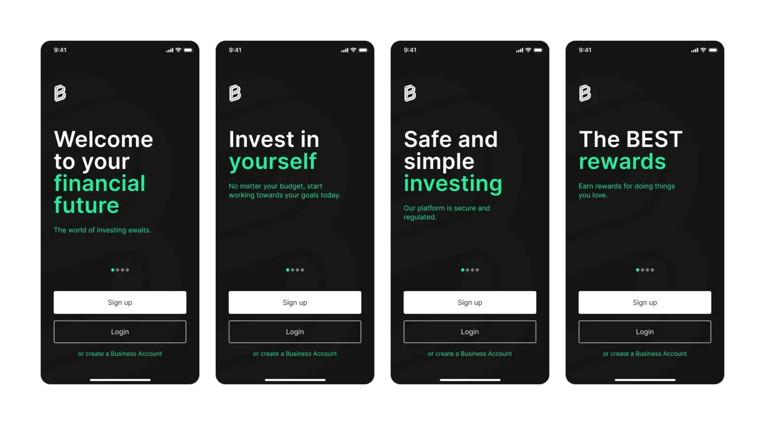
Despite prioritizing user experience and security, Bitpanda identified a need to improve its entrance door (splash screen) to foster a more intuitive and welcoming user experience and establish a trust-based relationship with users. Additionally, we aimed to improve user activation as part of initiatives born from a UXR project I led, which identified key areas where user onboarding and initial engagement could be enhanced.
Task
The task was to redesign the splash screen for Bitpanda’s broker app to create a more communicative, engaging, and user-friendly experience. The goal was to achieve a 10-12% increase in user sign-ups and gather feedback from users with a better App perspective, by improving the storytelling and making the user experience more intuitive.

Actions
01. Discover
User Research, key Learnings:
➡️Conducted a UX audit and usability testing to identify pain points in the onboarding process.
➡️Analyzed competitors’ splash screens and trust-building features.
➡️Users assumed the most traded assets were shown on the splash screen.
➡️Users struggled to find the sign-up button.
➡️The prominence of cryptocurrencies on the splash screen confused users.
➡️The value proposition was not communicated.
➡️Missed opportunity to demonstrate the company’s value before user sign-up.
02. Define
Problem Definition:
The current splash screen lacked clear communication and users found it confusing.
Goals:
🥇Communicate the purpose and value of the app effectively.
🥇Provide a more intuitive and welcoming user experience.
🥇Align the design with the new look and feel of the company.
Design Principles:
👑Communicate the broker app’s benefits and value proposition.
👑Build users’ knowledge, trust, and motivation.
👑Use consistent branding and design elements.
👑Ensure ease of navigation with a clear call-to-action for sign-up or log-in.
03. Develop
Content Exploration:
➡️Defined tone and voice, storytelling approach for splash screens.
➡️Decided on four screens: welcome, knowledge, motivation, and trust.
Concept Exploration:
📱Experimented with different screen structures and layouts.
📱Prototyped animations for the splash screens.
📱Ensured consistent content level to avoid visual overload and confusion.
User Testing:
🧪Gathered feedback from users on multiple iterations.
🧪Incorporated user insights into the design to ensure it was visually engaging, user-friendly, and trust-building.
04. Deliver
Final Design:
🗃️Created documentation for engineers, mapping all elements on screens with tokens and components.
🗃️Provided sizing and prototyping with animations.
🗃️Conducted refinement sessions with engineers for adjustments.
🗃️Developed documentation for future iterations to ensure consistency in updates.
Result
The redesigned splash screen resulted in an 8% increase in user sign-ups and positive user feedback. The new design effectively communicated the app’s value proposition, built trust with users, and provided a more intuitive user experience.

Final thoughts
We aimed to create a more communicative, engaging, and user-friendly onboarding experience by revamping the splash screen for the broker app. Through our research and design process, we identified key issues with the existing splash screen and developed design mandates that addressed them. We explored different screen structures, styles, and layouts while keeping consistency and clarity in mind.
This project also brought me valuable experience that contributed to maturing my design process, as well as gaining a deeper understanding of the importance of user research and the impact it has on informing decisions. Conducting usability testing helped me appreciate the value of iterative design and the power of user feedback in refining the user experience. Additionally, collaborating with cross-functional teams highlighted the significance of effective communication and fostering strong relationships to drive successful project outcomes.
I would have loved to continue monitoring and improving this project as planned in the mid-term strategy. One way to do so would be to establish a more robust system for tracking and analyzing data. This would provide insights into areas of improvement. Additionally, conduct more usability testing and do heat map analysis to better understand the performance of the new splash screens.